Bing is testing a new search results layout that changes the color of the logo from gray to the yellow/orange, changes the color of the search button and removes the gray background color from the right side rail. Bing has also cleaned up the interface, giving it a tighter but more open look, while keeping […]
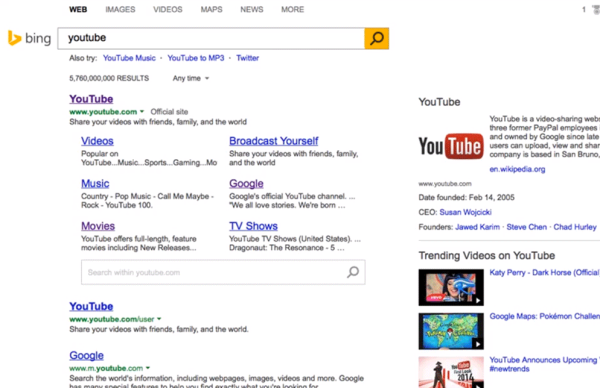
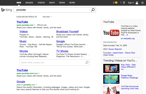
 Bing is testing a new search results layout that changes the color of the logo from gray to the yellow/orange, changes the color of the search button and removes the gray background color from the right side rail.
Bing has also cleaned up the interface, giving it a tighter but more open look, while keeping most of the existing content and features.
@rgomezric notified me of the change and posted a YouTube video.
Here is a comparison, showing you both the new and the current design.
New Test Bing Layout:
Current Bing Layout:


