They say, “it’s the little things in life.” In the context of content, little things like microbrowser optimization pay off in huge ways.
There are a number of common phrases that speak to the power of “small” things. “Good things come in small packages” or “small but mighty” are just a couple that come to mind. But small content – in length, but especially in size on a handheld screen – holds enormous significance for brand storytelling and consumer engagement.
Marketers and their creative counterparts are committed to writing attention-grabbing copy, developing video content to stop a social-media user mid-scroll, and designing visuals that make websites an engaging place to spend time on screen. And the idea of content optimization is something marketers intrinsically “get.” Writing SEO-friendly copy, link building to optimize a campaign, creating different versions and sizes of content for “web vs. mobile” – these are all things a marketer thinks through during the stages of content creation and distribution.
But there are a few not-so-small dynamics that marketers must pay attention to in order to holistically optimize their digital content. The first is the opportunity to capitalize on “micro” moments of engagement with 10-20 second video clips. The second is a two-part trend, really: the value of microbrowser content and the resulting “dark social” space, or the social shares that contain no referral information about the source, that is often forgotten in campaign planning.
Micro-video clips engage users short on time and attention
As Forrester’s Dr. James McQuivey famously claimed more than a decade ago, one minute of video is the equivalent of 1.8 million words. Whether or not you agree with the math he used to arrive at that particular number, there’s no debating just how efficient a short video can be when it comes to educating an audience. In cutting a video down to the most important or compelling 10 to 20 seconds of content, marketers can quickly grab attention and drive viewers to take the desired action, whether it be an email capture, social media follow, a share, or a sale.
These micro-videos are so effective because they have a unique ability to delight and entertain in a condensed time frame. This is perhaps nowhere more evident than with game highlights. Sports fans thrive on video content, wanting to relive important moments again and again, or catch up on the action they missed on demand.
As a digital destination for sports fans, Bleacher Report even delivers those micro-video highlights while games are still in progress. In order to rapidly generate and publish the clips, Bleacher Report acquired the technology needed to automatically transcode videos into a streamable format, adjusting their quality and resolution and delivering them through a fast, reliable content delivery network.
By focusing on streamlining the creation of these micro-video moments, Bleacher Report saw an immediate (and impressive) increase in video views of 350%, and each month has seen an increase in total video views by 25%.
How to deliver the micro-video moments consumers crave
Micro-videos convert, but they’re also difficult to execute across all available sales and engagement channels. Depending on the platform, there’s a headline or accompanying description to write. The video content needs to adjust for both portrait and landscape, responsively expanding to fill the width of the screen while maintaining the right aspect ratio.

The alternative is static sizing, which can easily break page layouts, distort the image, or display black bars on either side of the video clip, limiting the “wow” factor of great content. Remember, you just have a few seconds to get the visual experience right, or someone may scroll past or bounce off a webpage.
With micro-video, small adjustments make a big impact. There are two ways to ensure micro-video experiences are the marketing “gold” they hold the potential to be:
- Cropping – With responsive video, be sure that as content adjusts to fill the screen of a desktop computer, tablet or smartphone, that the most important elements remain in view. Content-aware AI and machine learning technology can be leveraged to do this dynamically, creating multiple variants of every video in different aspect ratios so that it’s never a laborious editing process for marketing teams.
- Subtitles – While most YouTube videos are played with the sound on, 85% of video content watched on Facebook is viewed without sound. For this reason (and generally as a best practice for web accessibility and ADA compliance), create subtitles to go along with your micro-video content.
Optimizing for the “small but mighty” microbrowser
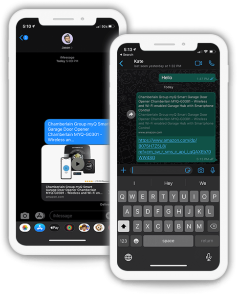
Now taking a wider-angle view of content, not just video, it’s important to understand the growing trend of peer referrals shared via microbrowsers. If the term is unfamiliar to you, think of a URL shared via text message, or links sent back-and-forth on platforms like Facebook Messenger, Slack or WhatsApp. The Cloudinary State of Visual Media 2020 Report found that 62% of people in the U.S. share links via iMessage, generating microbrowser previews that marketers often don’t account for. iMessage, for example, is designed to surface data to deliver an optimal microbrowser view, but not all microbrowsers do the same.
You’ve likely noticed when a link on one of these microbrowsers doesn’t generate any sort of helpful context, lacking a relevant thumbnail preview – whether image or video – that is auto-generated from the URL. While tiny in size, these microbrowser previews pack a powerful punch when it comes to user engagement. But the sad truth is, many companies and brands fail to consider how their website and content design might be impacting the preview that’s generated. With early-on alignment with front-end developers, marketers can be sure they’ve properly accounted for compelling imagery, video or text information that will load in a microbrowser.

Optimizing microbrowser previews increases the likelihood that peer-to-peer recommendations convert to the desired outcome. Not planning for microbrowser activity ahead of time puts an unfortunate limit on the impact of an otherwise compelling marketing effort. For this reason, marketing and dev teams should be working together to be sure the visual experience is consistent across all chat and messaging apps.
A cheat sheet for fixing microbrowser issues and getting macro ROI
Cloudinary’s State of Visual Media report found that more than one-third (36%) of links shared within microbrowsers don’t have their campaign IDs intact. If the link is copied and pasted by a user from a campaign, that original campaign is credited with the referral. Not understanding the big picture is a huge missed opportunity – the “dark social” space that hides meaningful campaign insights.
Understanding indirect microbrowser traffic and its relationship to social media can help correlate where conversions are really coming from, and whether you ought to boost or reduce spend accordingly to see a better ROI. Hiding out of sight, or at least with the wrong attribution, a percentage of direct traffic flows from microbrowsers to your website and the reporting analytics lead you to think that lead is coming through Facebook. In reality, that site visit is a result of a peer referral and knowing that precisely will help marketing teams plan better.
Link “unfurling” is another technical aspect of microbrowser referrals. Unfurled links are the previews of web pages inside of the private message, and they create, as previously discussed, a brand’s first impression. The person who shared the link with a friend or family member has already qualified the lead, so marketers must not let that opportunity fall flat because of a missing, misleading or unengaging preview.
Marketers should stay in communication with developers to be sure content is created and optimized to unfurl properly. A couple of best practices include:
- Selecting a specific (and compelling) unfurl image or video. Rather than hoping a default photo or video will be automatically pulled from the page, be intentional in determining the best one to compel a recipient to click through to view. This is ideally not the hero image on a webpage, but rather an image or video that is most representative of the “why” behind the click. If someone sends a link to view a handbag or new electronic gadget, ensure that the product is prominent, rather than a company logo or lifestyle photo where the product is too small to really see.
- Using short video ‘nanostories’ or animated GIFs. There are a few microbrowsers that don’t currently display video in an unfurled preview, so using other motion graphics or visuals can create the same look and feel, if planned ahead.
- Adjusting visuals for better engagement. If the media file itself is given a unique name, a developer can provide a marketer with analytics that show how frequently an unfurl image or video has been fetched. If you’re leading with that close-up shot of the handbag being worn, what is the click-through rate of interested shoppers? Does swapping it with something more seasonal, or a different angle, improve engagement? Pay attention to the story the data tells, and your microbrowser content will lead more people to your site.

Many of us have been told in life, “Don’t sweat the small stuff.” But in marketing, it really pays off when you do. In an increasingly digital world, with more time spent on screens and more competition for those eyeballs, paying attention to the “small” details of micro-video and microbrowsers is an opportunity that can’t be overlooked.


