Light mode shows a black ad label on a white background but on dark mode, it shows a gray ad label on a black background.
What it looks like. Here is a screen shot of the home page from 9to5Google:
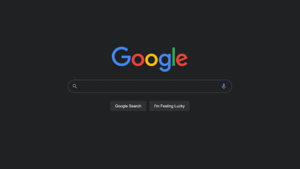
Here is what the top bar looks like today with the special Google Doodle in dark mode, this image was provided by Frank Sandtmann, a German based search marketer:

The ads are hard to distinguish. It is much harder to see the “Ad” label in the Google dark theme than it is in the light theme. I posted screen shots of this over here, here is how they compare. The screen shots are from @AMP_blows (a colorful Twitter name):
The dark theme has the Ad label in gray font while the light mode has the Ad label in black text, which is way more noticeable:

Google should really change the color of the Ad label to white, not gray, if they want to help searchers distinguish between the paid and free listings.
Turn on/off dark theme. If you are in this beta and you have access to the new appearance controls in Google Search, you will have an option in search settings to toggle on or off dark theme. There is an “appearance” section that gives you these three options; “device default,” “dark theme” or “light theme.”
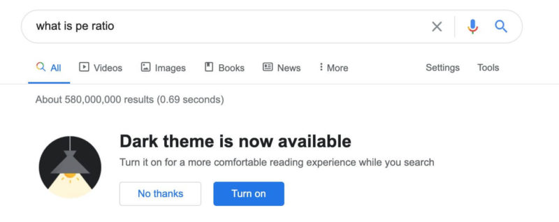
Also, when you first gain access to this feature, Google may notify you with this prompt:

Why we care. As Google rolls out dark theme to more searchers, the click through rate on your ads may be impacted. If searchers have a harder time distinguishing between the paid and free listings, it might cause confusion on what listing the searcher clicks on.
Also, Google rolling out dark themes in search is something that should not surprise anyone but should be on the radars of search marketers.


